NooraPaid
Atefeh Mohammadi · Amin AbediNaskh
 01 / 14
Presentation images © Atefeh Mohammadi · Omid Emamian, shown with credit.
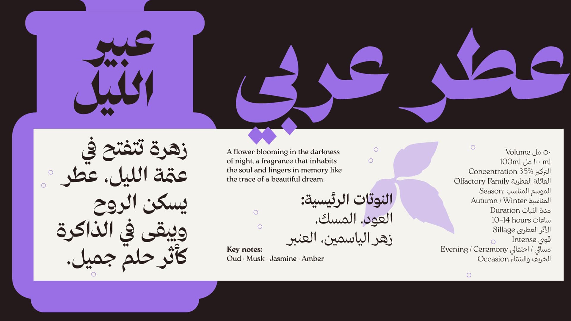
An examination of text typefaces reveals a gap between cold formality and unstable informality: there is little space for typefaces with greater balance in form and white space. Shams was designed to fill this gap, with a medium x-height, moderate density, relatively open counters, and a balanced relationship between black and white space. Its letterforms are inspired by personal Naskh handwriting and the scripts of calligraphers, creating a human and trustworthy character alongside readability. The result is a calm, balanced typeface that allows text to be both read and felt.