Sharp
SinPaid
Mehdi RavandiNaskh
 01 / 06
Presentation images © Mehdi Ravandi, shown with credit.
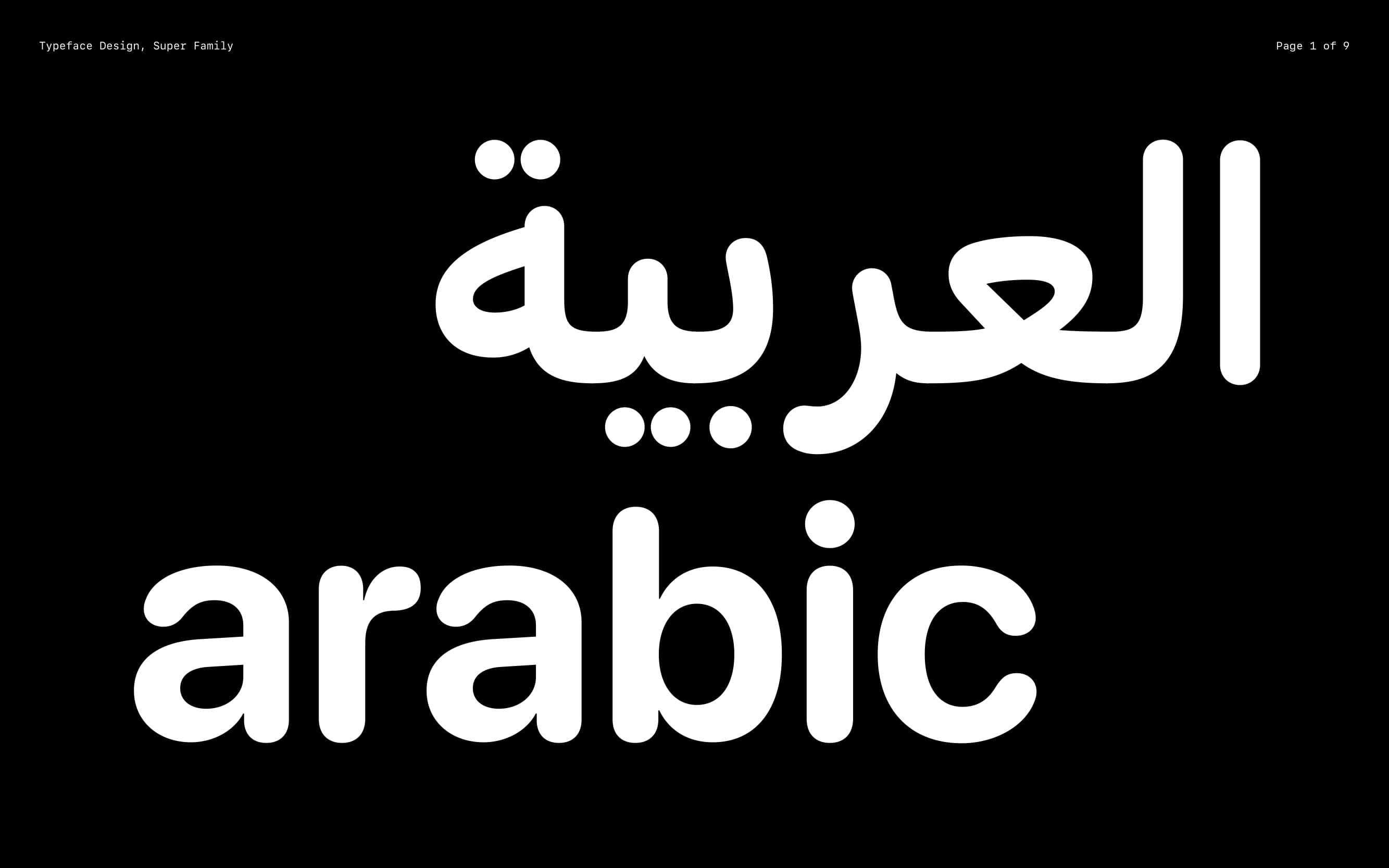
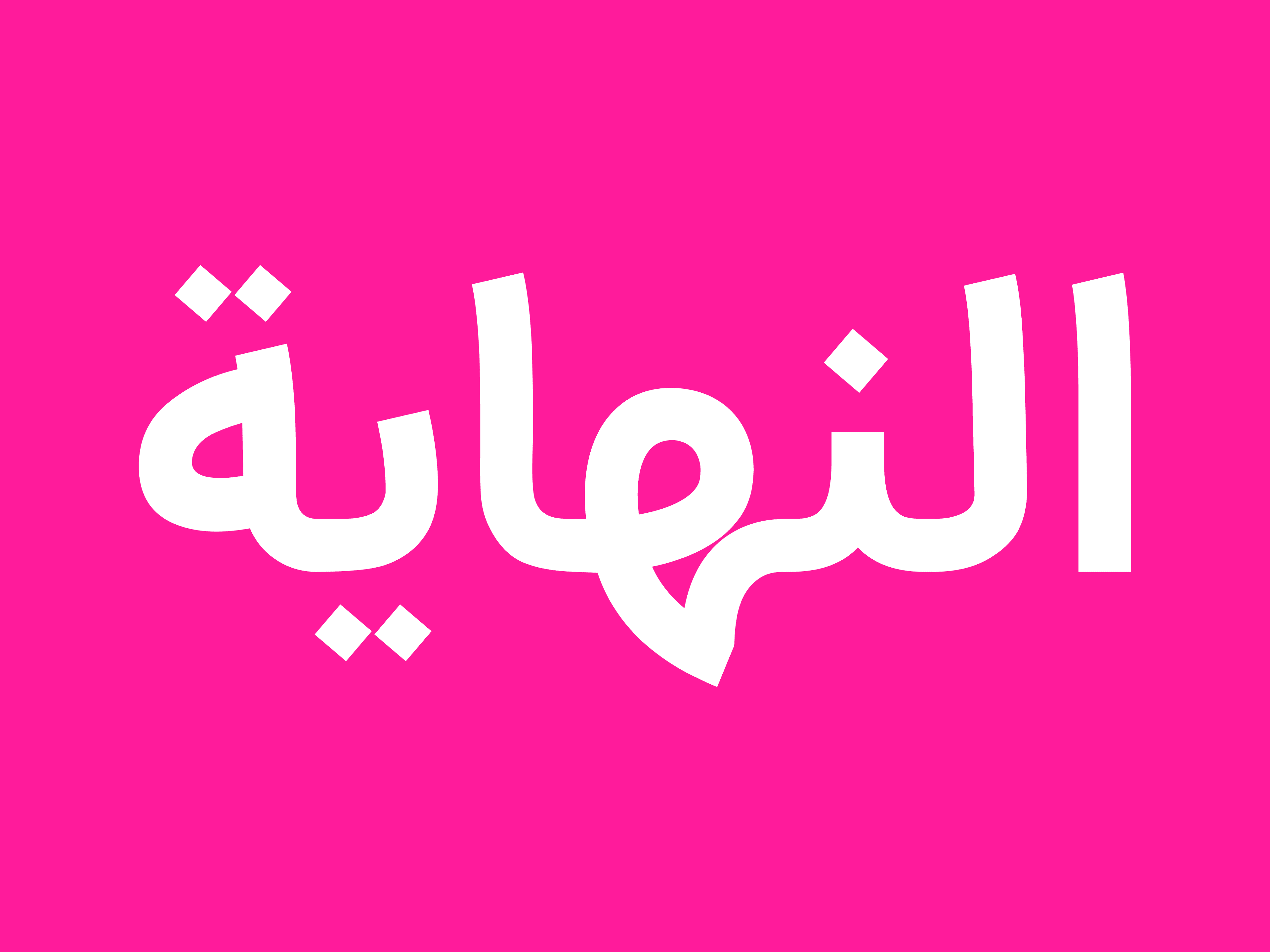
Daal is a monoline typeface built around a nearly uniform stroke width that defines the structure of its letterforms. The reduction of strong variations in stroke thickness simplifies and unifies the forms, giving the typeface a contemporary and direct character.
Curves play an important role in the design of Daal. Many of the letterforms are shaped through soft arcs and rounded transitions, allowing the forms to remain fluid and continuous while retaining their simplicity. Daal is shaped by a balance between order and movement; its forms are simple, yet avoid feeling entirely geometric or mechanical.
This quality also becomes apparent in the way the letters come together. Rounded and elongated forms create a continuous rhythm across words, giving Daal a distinct visual character that remains recognizable across different sizes and applications, from text and headlines to user interfaces and graphic design.
Daal font is available in three weights: Thin, Regular, and Bold. This range provides contrast and hierarchy within typographic compositions and extends the family’s versatility across print and digital environments.
Daal is designed for Persian and Arabic and developed with both print and digital applications in mind. A simple, contemporary family whose identity is defined above all by its uniform stroke, soft curves, and straightforward letterforms.