DaalPaid
Mehdi RavandiNaskh
 01 / 07
Presentation images © Mehdi Ravandi, shown with credit.
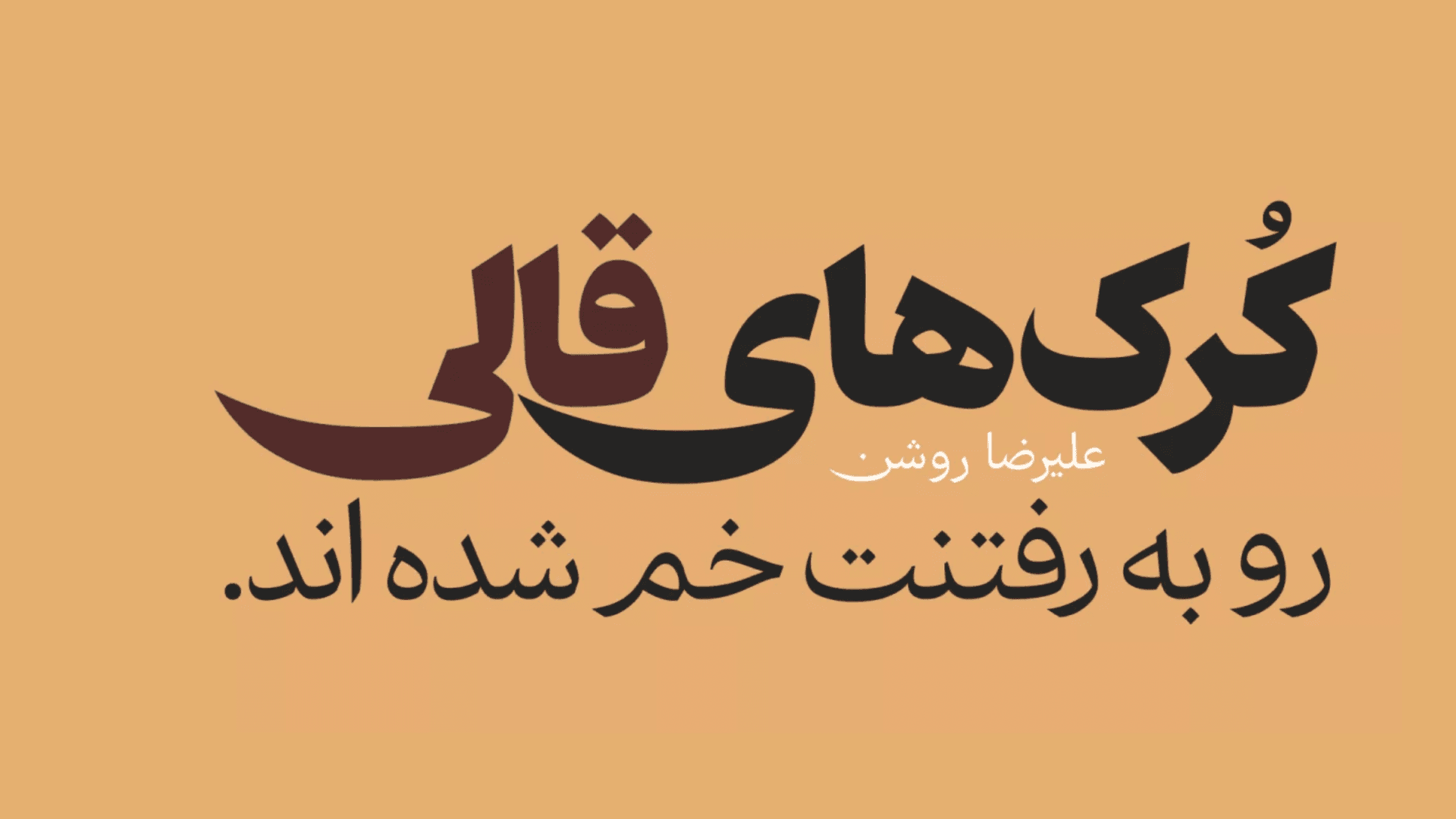
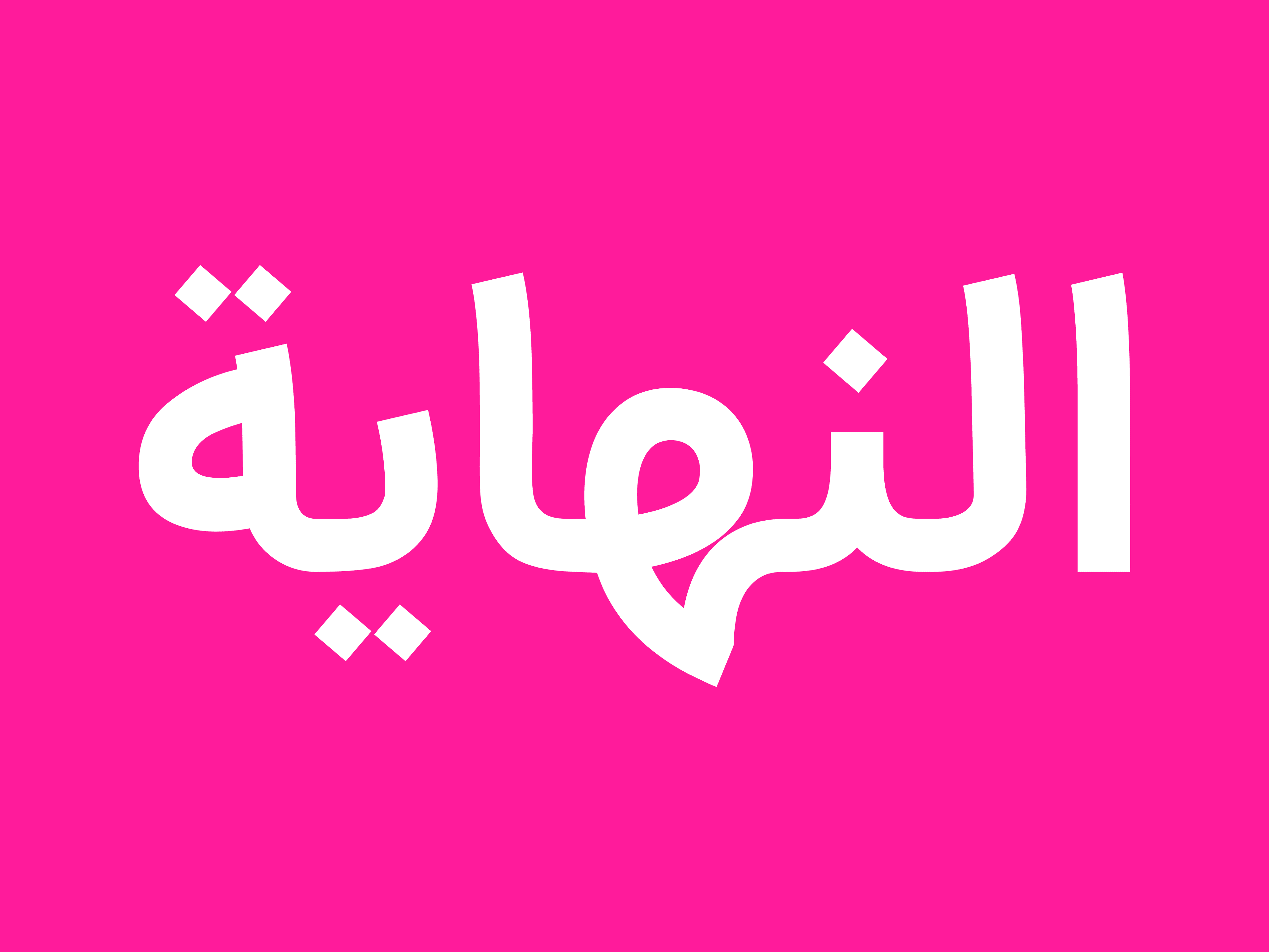
Sin typeface is a free interpretation of Naskh, where familiar forms take on a new character under the pressure of weight and density. The underlying structure of Naskh remains recognizable, yet shifts in proportion, weight, and the relationship between positive and negative space move the letterforms away from their conventional shapes.
In Sin font, increasing the weight goes beyond simply thickening the strokes; forms draw closer together, counters become tighter, and words begin to form a denser, more unified surface. In this way, Sin retains its roots in Naskh while developing a distinctly contemporary and visual character.
In Sin font, order is less a rule than a point of departure, allowing the forms to move freely beyond conventional boundaries. Sin seeks to move away from the idea of Naskh as a fixed and unchanging structure—not by abandoning its essential characteristics, but by opening them to variation and experimentation from within. The familiar forms remain, while their relationships with weight, space, and one another are transformed, resulting in a bold and cohesive typeface that acknowledges its roots while pursuing a more contemporary expression.